What the $1 Bill Used To Look Like
As the United States entered the turbulent era of the Civil War, the government set aside long-standing concerns about nonmetallic currency and began issuing a series of paper banknotes in 1861. These “Demand Notes” were printed in denominations of $5, $10, and $20 — but not the lone dollar.
The $1 bill finally arrived the following year with the next generation of paper currency, known as United States Notes (or Legal Tender Notes), and the bill has since made up for its delayed arrival by becoming the most common denomination in circulation today.
Of course, that 1862 $1 note — or any dollar bill printed before the mid-20th century — would likely draw a double take from modern eyes, as paper currency has undergone numerous aesthetic changes since the days of the Civil War. Here’s a look at some of the notable designs to grace the sides of the humble dollar over the years.
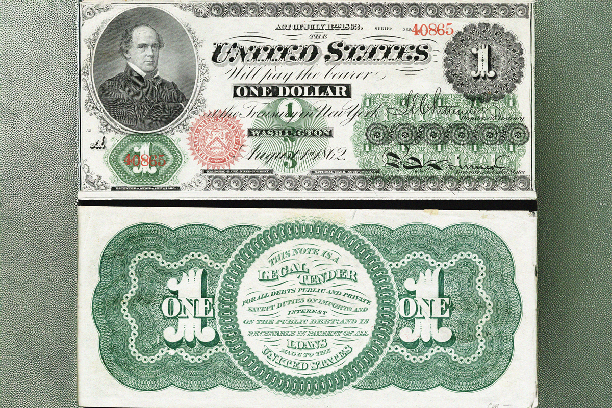
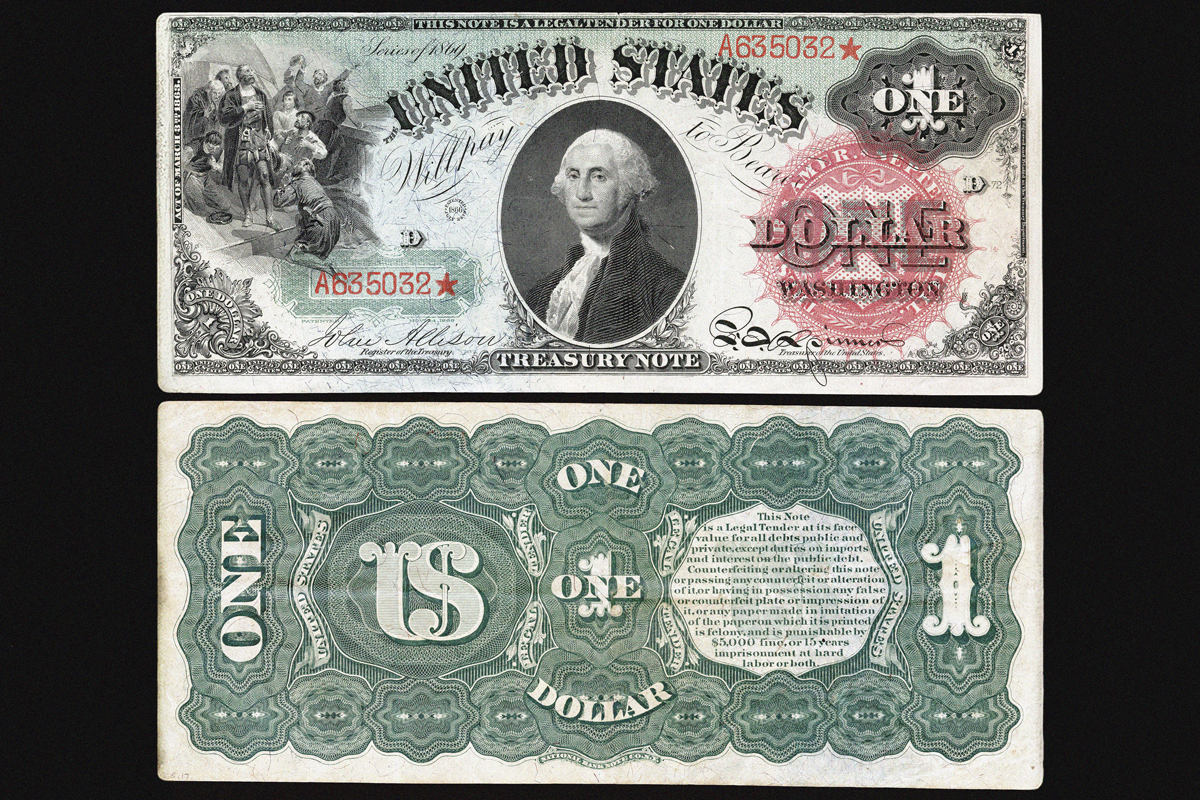
1862 United States Note
Like most paper currency of this period, the first $1 bill incorporated a mishmash of fonts and shapes across a crowded obverse (front), while the back featured a green ink-rendered display of lathework surrounding an inscription of the government’s legal obligation to the note holder. But the most notable highlight may well have been the picture of the serious-looking fellow who is decidedly not George Washington, nor any other easily recognizable statesman, for that matter. The denomination’s first portrait instead went to Salmon P. Chase, who served as secretary of the Treasury and chief justice of the Supreme Court.
You may also like
More from our network


1869 United States Note
The 1869 $1 note was a little closer to the contemporary design: George Washington made his first appearance, albeit with a sunnier disposition than the portrait that surfaced later. The central position of his portrait, the font printed beneath him, and the serial numbers located on the lower left and upper right of the bill set the standard for designs to come. Obvious differences include the vignette of Christopher Columbus on the upper left of the obverse, and a lathework-heavy reverse with the legal obligation wording pushed off-center. Additionally, this eye-catching bill featured various blue, green, and red tints, inspiring its "Rainbow Note" nickname.
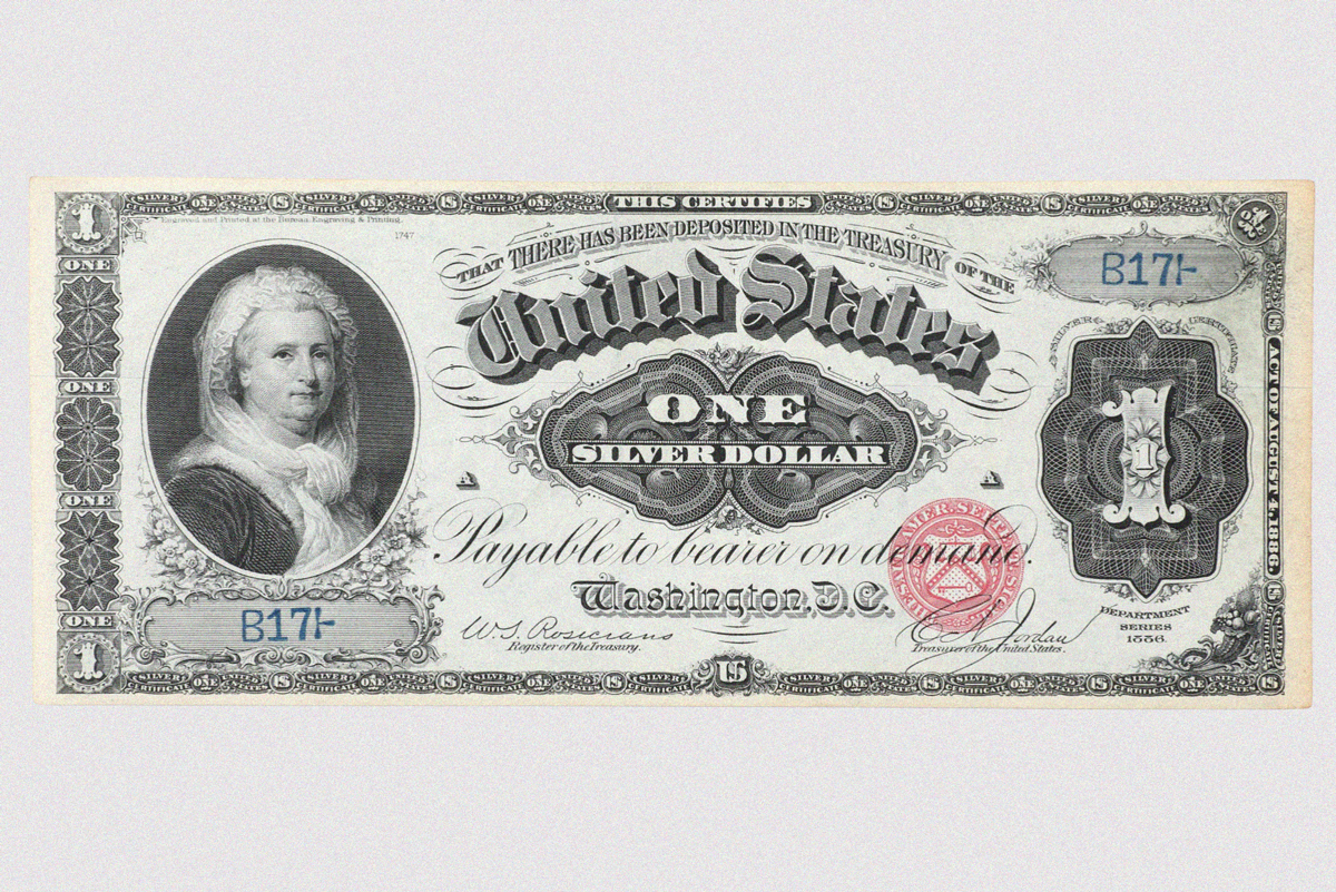
1886 Silver Certificate
The U.S. Treasury began issuing silver-backed paper certificates in denominations of $10 to $1,000 in 1878, before the first $1 silver certificate appeared in 1886. With it came the face of Martha Washington, the first woman to appear as the primary portrait on U.S. paper currency (though Pocahontas appeared on an earlier $20 bill as part of a larger scene). The choice of the first U.S. first lady for the note was generally lauded, even if her picture drew mixed reviews, and Mrs. Washington's visage made a return appearance for the 1891 $1 silver certificate.
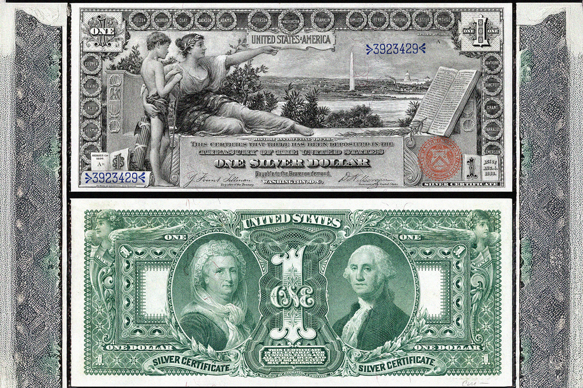
1896 Silver Certificate
Admired for their elaborate neoclassic designs, 1896 silver certificates are known as the "Educational Series" for scenes that illustrate the best of American industry. The obverse of the $1 certificate showcased the "History Instructing Youth" engraving of a half-reclining woman, one arm around a boy and the other pointing toward Washington, D.C., and an open book. The reverse featured portraits of the first couple, George and Martha Washington. While these bills made a strong visual impression, the copious amount of black ink used to print the front sides caused smudging problems, and bankers complained about an inability to rapidly distinguish between the different denominations, forcing the Treasury to quickly scuttle the series.
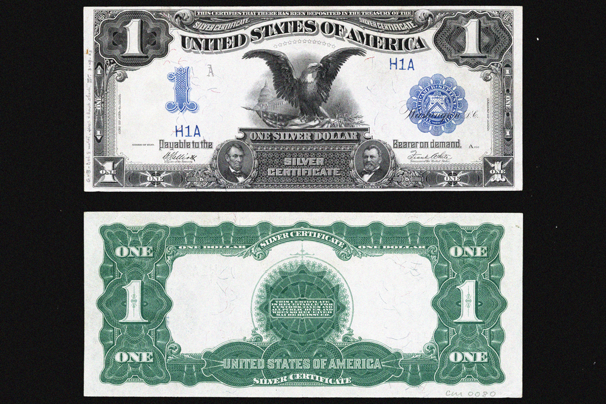
1899 Silver Certificate
Designed with the intent of appearing "so distinctive there will be no difficulty in confusing them," according to the Treasury, the 1899 silver certificate avoided the complications that plagued the preceding Educational Series, and its $1 notes endured until being replaced in 1923. While the reverse of this denomination reflected a minimalist aesthetic with its central starlike shape surrounded by an expanse of white space, the obverse featured an eye-catching eagle gripping an American flag, prompting it to be known as the "Black Eagle Note." Additionally, the front included smaller portraits of both Abraham Lincoln and Ulysses S. Grant, marking a rare occasion that multiple presidents appeared on the same note.
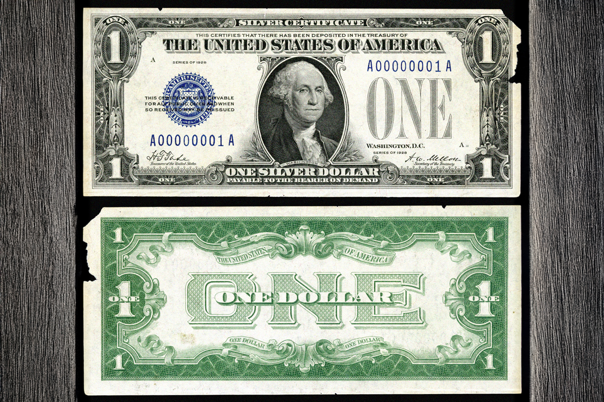
1928 Silver Certificate
The 1928 $1 silver certificate was among the first of the small-size bills that circulated as part of efforts to save money on production costs. By this point, the layout of the obverse looked largely similar to that of the modern dollar bill, with the blue Treasury seal to the left of Washington's portrait among the noticeable discrepancies. But the biggest differences can clearly be found on the reverse, where an unusual-looking light green border and large printed "ONE" prompted the note’s "Funnyback" nickname. The Funnyback layout remained in place for the following series of $1 silver certificates, before President Franklin D. Roosevelt and Cabinet member Henry Wallace teamed up to commission a reverse modeled on the Great Seal of the United States for the 1935 releases.
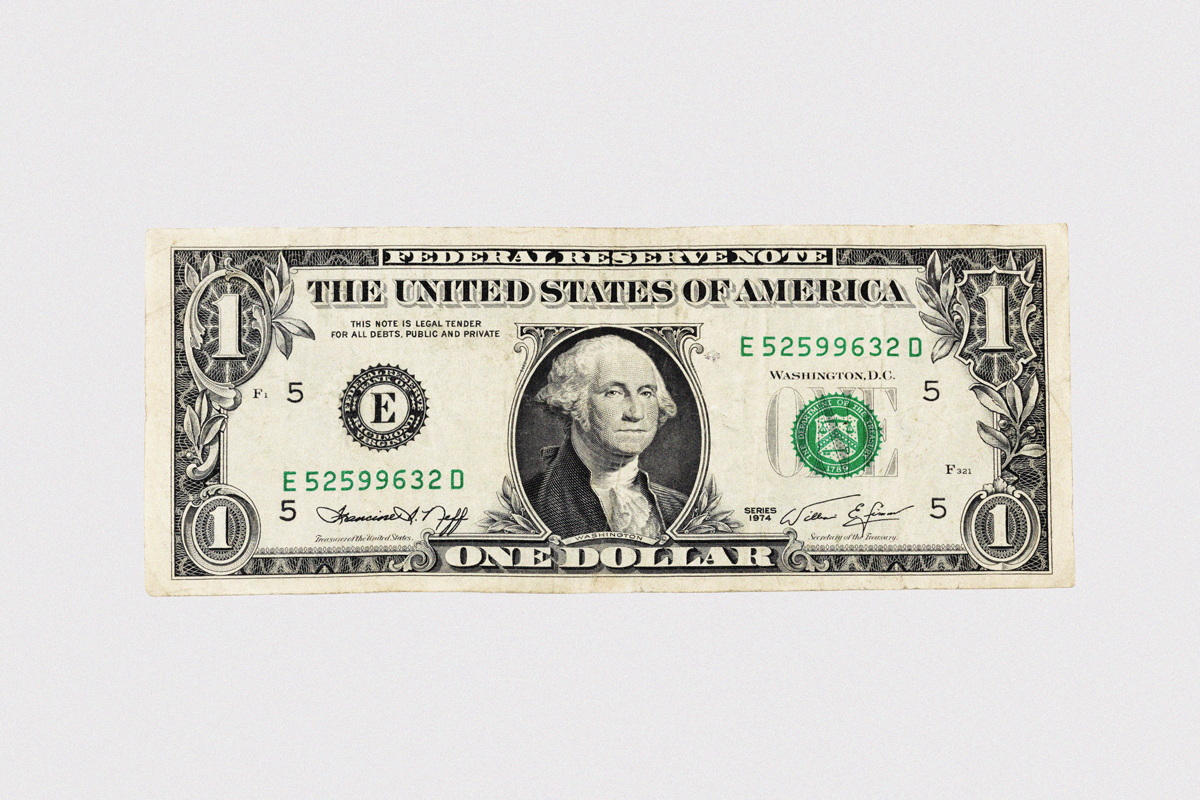
1963 Federal Reserve Note
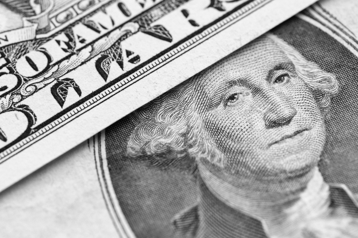
While the first Federal Reserve Notes were issued in 1914, it wasn't until 1963 that the $1 denomination appeared among these notes, which now make up the bulk of the paper money in circulation. This version is the dollar as we know it. The bill features an obverse with Washington's stone-faced portrait flanked by the Federal Reserve District seal to the left and Treasury seal on the right, and a reverse marked by the two sides of the Great Seal and the motto "In God We Trust," which was added to paper currency in 1957. While the other major denominations have undergone design changes in recent years, with colors and watermarks added to help deter forgeries, the $1 has remained unchanged since 1963. The bill's low value makes it less likely to be counterfeited and a recurring congressional provision precludes its redesign, ensuring the familiar $1 bill will endure for generations.


