If you’ve ever wandered the aisles of an office supply store, you may have noticed something curious: For all the different pens, folders, and desk gadgets on display, paper doesn’t offer much in the way of variety. In the United States, the go-to sheet of printer paper is 8.5 inches wide and 11 inches long, and it has been for decades. So who made that call?
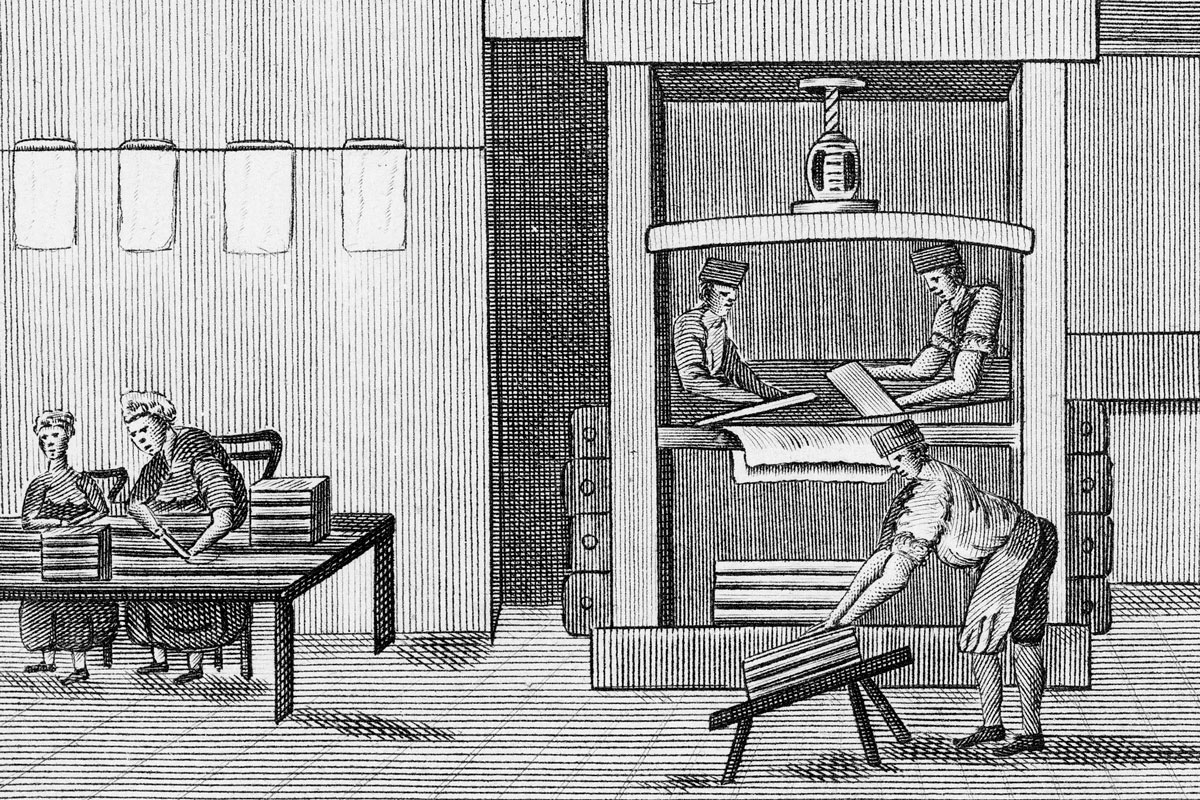
The answer goes back to the 1600s, when Dutch papermakers used wooden molds to form sheets of paper from big vats of watery pulp. The molds had to be big enough for the vatman — the worker handling the frame — to lift and shake comfortably. Through trial and error, papermakers settled on molds roughly 44 inches long, the average span of a worker’s outstretched arms. When that large sheet was quartered, the resulting pieces measured about 11 inches on their long side.
The origin of the width is less certain, but historians point to the molds’ original 17-inch dimension. Halved, that produced the familiar 8.5-inch width. In other words, the size of the modern office memo may be the legacy of how far a 17th-century worker could stretch their arms.
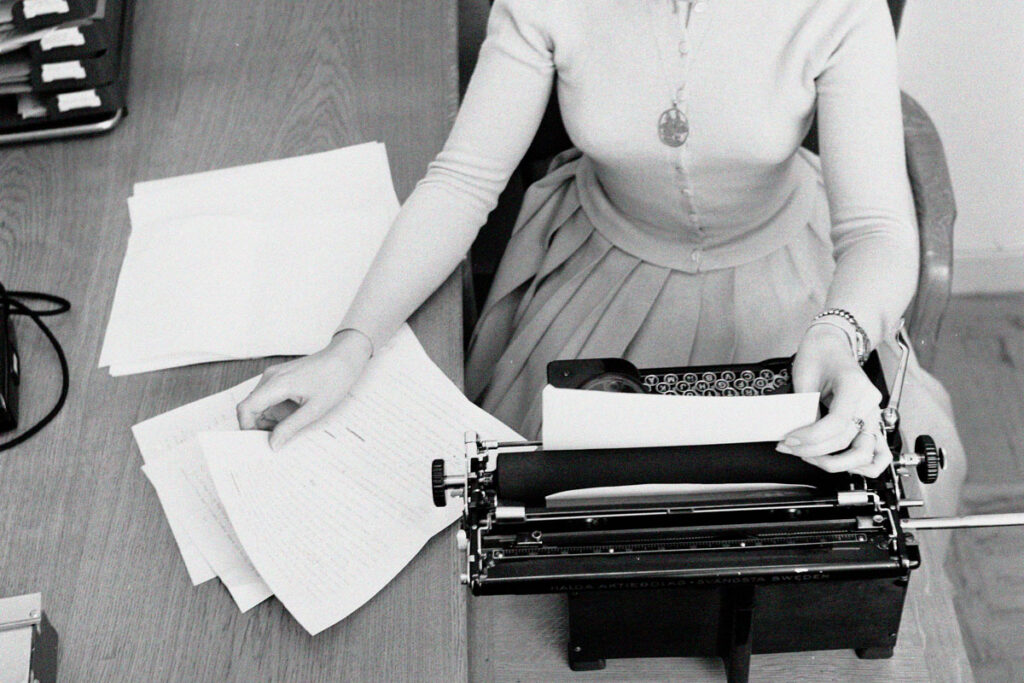
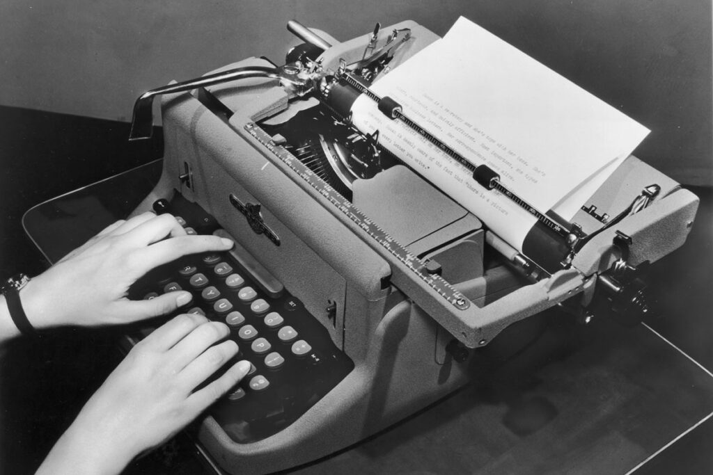
That still doesn’t explain why this size became the American standard. For that answer, we need to skip ahead to the 20th century, when typewriters, copiers, and printers made uniformity a necessity. A sheet measuring 8.5 by 11 inches accommodated a comfortable line length — 65 to 78 characters after accounting for margins. It also minimized trimming waste when paper was cut down from larger “parent” sheets, which were often 17 x 22 inches.
For a time, the U.S. government complicated matters. In 1921, the federal government adopted 8 by 10.5 inches as the standard size for official letterhead. Around the same time, a separate industry group — part of Herbert Hoover’s effort to reduce waste — settled on 17 by 22 inches as the size of the “parent” sheet. Halved, that produced the commercial 8.5 by 11 size that everyone outside the government was already using.
The mismatch persisted for decades, with bureaucracy running on one standard and businesses on another. It finally ended in the early 1980s, when President Ronald Reagan mandated 8.5 by 11 inches for all federal forms, aligning Washington, D.C., with the rest of the country.
Advertisement
Advertisement
As for legal-size paper — standard paper’s elongated 8.5-by-14-inch sibling — that likely owes its extra 3 inches to lawyers who wanted more room for dense contracts. Today, it’s just as likely to appear in restaurants, where that bonus space comes in handy for sprawling menus.
So the real reason your printer uses 8.5-by-11-inch paper? A mix of ergonomics, industrial efficiency, and administrative tidiness — all rooted, improbably enough, in the reach of a 17th-century papermaker’s arms.
It’s one of the most enduring images of the 19th century: a Victorian lady, corseted and coiffed, collapsed on a fainting couch. The idea appears repeatedly in literature and period dramas, and has become a kind of shorthand for the female condition during Queen Victoria’s reign. But did women of the era really swoon so easily and so frequently?
There are certainly many reasons to believe fainting was common; life in Victorian England wasn’t always the most sanitary or healthy, and women’s clothing was often elaborate and restrictive. But while these factors explain occasional collapses, they don’t tell the whole story.
In the mid-18th century, novels started to become popular in Britain, and a social tradition known as the culture of sensibility dominated the evolving medium, rooted in Enlightenment ideas about moral improvement. Literary works celebrated emotion as a sign of morality, depicting weeping and fainting — by both women and men — as signals of virtue.
The tradition continued into the 19th century. Fainting was still a common trope, but it was often framed as “swooning,” a softer, more romantic take that made it a natural fit for fiction — and usually, though not exclusively, for female characters. Writers such as Charles Dickens and Charlotte and Emily Brontë frequently used fainting not as a medical event but as a dramatic plot device that portrayed shock, fear, repression, or being overcome with emotions.
Novels and their later dramatic adaptations helped popularize fainting, but Victorian society made it believable. Strict gender roles were the norm, with men expected to be rational and sturdy and women gentler and more fragile. These conventions helped reinforce the ideals that valued women as morally upright and composed, yet prone to emotional delicacy.
Fainting, then, was a socially acceptable — even expected — way for women to express emotion: It was seen as just dramatic enough without being rebellious or excessive. A sudden swoon could signal just the right kind of femininity, perhaps acting as more of a social cue than a physiological event. Even mild episodes — a moment of dizziness or a need to sit down — were easily dramatized with props such as smelling salts carried around in beautiful cases, helping to punch up the cultural script.
Victorian fainting, of course, wasn’t all fiction. People fainted then as they do now, and 19th-century English life was rife with conditions that could make anyone lightheaded. Poorly ventilated homes that burned coal for heat; crowded and polluted cities; arsenic-laced beauty treatments and wallpaper; and even dangerous additives in food posed additional, very tangible, hazards. Add to that the weight of layered Victorian clothing, and it’s easy to imagine moments of dizziness.
Of course, no discussion of Victorian fainting is complete without mentioning corsets. An essential part of the Victorian silhouette, corsets could indeed restrict breathing or affect blood pressure, especially if tightly laced. But historians agree that the idea of women regularly tight-lacing to the point of passing out has been largely exaggerated. Most women wore corsets for support, not spectacle; women of all classes were able to work or remain active even while wearing the everyday garment. It is probable, however, that corseting, along with these other environmental factors, did contribute to some lightheadedness and fainting during this era.
The image of women draped dramatically in parlors or fainting rooms — which, along with the famous fainting chairs, didn’t acquire their names until the turn of the 20th century — owes more to melodrama and modern imagination than it does to historical reality. The Victorian era had no shortage of medical issues, from infectious diseases such as cholera and typhoid to heart problems and complications during childbirth. But fainting wasn’t a persistent epidemic. Instead, it very likely became a myth that persists today as part of the broader Victorian idea of female fragility.
There was a time when seeing the doctor didn’t mean sitting in a crowded waiting room or logging in to a patient portal. Instead, the doctor came to you, carrying a black bag and bringing their expertise and equipment to your bedside.
Today, health care looks very different. We drive to medical campuses filled with imaging suites and labs, check in electronically, and have our patient notes transcribed by AI. The transformation has been so complete that it can be hard to imagine the house call was a central feature of American medicine little more than a century ago. So what changed?
From the earliest days of American medicine through the early 20th century, house calls were a routine part of medical care in the United States. Physicians regularly traveled to patients’ homes in cities and rural areas alike. In 1930, approximately 40% of physician visits were house calls, according to the New England Journal of Medicine.
Most doctors were general practitioners who worked with patients of all ages. They delivered babies, set fractures, drained infections, treated pneumonia and influenza, and managed chronic illnesses. Medications were often dispensed directly from the physician’s bag. Payment could be made in cash or, particularly in rural areas, in goods or services.
Doctors did maintain offices, but they were often modest — sometimes located in the physician’s home — and equipped with limited diagnostic tools. Hospitals existed, but they were typically reserved for surgery, serious trauma, or advanced illness. Much everyday medical care happened in the home.
The decline of house calls was gradual at first and then dramatic. By 1950, house calls accounted for roughly 10% of physician visits; by 1980, they made up less than 1%.
Several forces drove this change. First was the rapid expansion of medical technology in the 20th century. X-rays, laboratory diagnostics, safer anesthesia, blood banking, antibiotics such as penicillin, and eventually intensive care units transformed medicine. These advances required equipment, sterile environments, and trained support staff that could not be replicated in private homes. Hospitals became safer and more effective, particularly after improvements in antiseptic technique and infection control.
Second, medicine became increasingly specialized beginning in the late 19th and early 20th centuries. Rather than one physician handling nearly every complaint, patients began seeing cardiologists, obstetricians, surgeons, and other specialists who relied on centralized offices and hospital facilities. As care grew more complex, the home visit became less practical.
Alongside advances in medical technology, economics played a decisive role in the decline of house calls. Even before the mid-20th century, home visits were time-consuming. A physician might see only a handful of patients in an afternoon of travel, compared with many more in a centralized office setting. As automobile ownership expanded and suburbs spread outward after World War II, the distances between patients grew, making travel even less efficient. Office-based care allowed physicians to treat more people in less time.
World War II intensified these pressures. An estimated one-third of American physicians entered military service during the war, creating shortages in many civilian communities. With fewer doctors available, maximizing efficiency became essential. Centralized offices and hospital-based care enabled the remaining physicians to manage larger patient loads, making routine house calls even more impractical.
At the same time, the structure of payment was changing. The growth of private health insurance in the 1930s and 1940s — followed by the establishment of Medicare and Medicaid in 1965 — formalized billing systems. Office visits were easier to standardize, document, and reimburse consistently. Home visits required travel time and longer appointments, yet reimbursement did not always reflect those additional costs, making them less financially sustainable.
Meanwhile, group practices and multi-physician clinics became increasingly common in the postwar decades. Shared equipment, centralized staff, and predictable scheduling improved productivity and stabilized revenue for doctors.
Social change similarly played a role in the decline of house calls. As more families owned cars, traveling to a physician’s office became feasible for many folks who once relied on home visits. Urbanization, improved road systems, and expanded hospital networks also reduced geographic isolation.
Home births illustrate the broader trend. In 1900, nearly all U.S. births took place outside of hospitals, attended by either a doctor or midwife. That rate fell to 44% by 1940 and just 1% by 1969, reflecting growing confidence in hospital-based obstetric care, anesthesia, and neonatal medicine. As childbirth shifted to hospitals, one of the most common reasons for physician house calls largely disappeared.
Concerns about safety and liability also influenced practice patterns. Controlled clinical environments allowed for better infection control and standardized procedures. As medicine professionalized and regulatory standards expanded during the 20th century, office- and hospital-based care became the default model.
By the 1980s, traditional house calls had largely vanished — but they have not disappeared entirely. Geriatric and palliative care programs now provide in-home services for elderly or homebound patients. And research from the Department of Veterans Affairs and other programs has shown that home-based primary care for patients with complex chronic conditions can reduce hospitalizations and lower overall health care costs while maintaining high patient satisfaction. Telehealth has also created a new version of the house call. During the COVID-19 pandemic, virtual visits expanded dramatically after regulatory barriers were temporarily eased. While telemedicine has declined from its 2020 peak, it remains a routine part of care in many health systems.
Advertisement
Advertisement
Popular Breakfast Foods That Used To Be Dinner Foods
Why do pancakes remind us of a lazy Sunday morning ritual but seem like a strange choice at 7 p.m. on a weekday? And why do we whip up an omelet before work but rarely think to serve eggs for dinner? Many of the foods we now associate with breakfast weren’t always tied to the first meal of the day. Indeed for much of history, the idea of “breakfast foods” didn’t exist at all.
While breakfast has been around for centuries, the modern concept of it as a specialized category of food emerged primarily in the late 19th and early 20th centuries. Before the Industrial Revolution, meals were shaped largely by agricultural labor cycles and household food availability, and people commonly ate similar foods throughout the day. Industrialization transformed daily life by imposing standardized work hours and commuting routines, creating demand for quick, portable, and easily digestible morning meals.
Meanwhile, the rise of packaged foods, advertising, and mass media introduced new ideas about nutrition, health, and productivity, helping define what breakfast should look like. Here are six foods that once graced the dinner table but have become associated primarily with breakfast.
In colonial America and through much of the 19th century, pancakes — also known as flapjacks, hoecakes, johnnycakes, or slapjacks — were served not just at breakfast but also for dinner (the day’s main midday meal, or what we’d call lunch today) and supper. Early American cookbooks, such asAmerican Cookery (1796), include multiple versions of pancakes made from wheat flour or cornmeal. They might be eaten with butter, molasses, maple syrup, or alongside savory dishes and meat drippings. Rather than belonging to a specific mealtime, pancakes functioned much like bread: inexpensive, filling, and adaptable.
Their tighter identification with breakfast developed gradually in the late 19th and early 20th centuries. As printed breakfast menus became more standardized in hotels, restaurants, and eventually diners, pancakes appeared more consistently as a morning offering. Commercial baking powder made lighter cakes easier to prepare, and affordable syrup brands such as Long Cabin and Aunt Jemima (introduced in 1887 and 1888) reinforced the pairing of pancakes with sweet toppings and the morning meal. By the mid-20th century, pancakes were culturally framed almost exclusively as breakfast food, and their long history as an all-day staple was largely forgotten.
For much of American history, neither bacon nor eggs belonged exclusively to breakfast. Eggs were an everyday, all-purpose food in the 18th and 19th centuries, appearing at breakfast but also at dinner and supper in omelets and other fried or baked dishes. Cookbooks such as The Virginia Housewife (1824) include savory egg dishes suited to the day’s main meal. Bacon, meanwhile, was part of the broader salt pork tradition, valued for its preservation qualities and caloric density. In colonial and 19th-century households, cured pork was commonly served with beans, greens, cabbage, or potatoes, or used to flavor stews and vegetables.
The strong association of bacon and eggs with breakfast took shape in the 1920s. Seeking to boost sales, the Beech-Nut Packing Company launched a publicity campaign promoting the foods as the ideal hearty breakfast. The effort encouraged physicians to endorse substantial protein-centered morning meals and publicized the pairing nationwide. Restaurants, hotels, and the growing American diner culture soon standardized bacon and eggs as the centerpiece of breakfast menus. By the mid-20th century, the combination had become synonymous with “the most important meal of the day” — overshadowing the long history of both foods as common components of dinner and supper.
Hash began as a practical leftover dish. The word comes from the French hacher, meaning “to chop,” and by the 18th and 19th centuries, English and American cookbooks described hash as chopped cooked meat — often beef or mutton — reheated with onions, potatoes, and gravy. Before refrigeration, this was an economical way to repurpose Sunday roasts into the next day’s dinner or supper. Many early American cookbooks include hashed meat recipes as main dishes rather than breakfast fare. By the mid-19th century, inexpensive restaurants serving cheap, reheated fare were colloquially known as hash houses.
Hash migrated to the breakfast table gradually in the late 19th and early 20th centuries. Its ability to be reheated quickly made it well suited to restaurant and hotel breakfast service, and by the early 1900s corned beef hash appeared regularly on printed breakfast menus. The growth of diners further cemented the association — particularly as canned corned beef became widely available in the late 19th century. By the mid-20th century, hash was primarily a breakfast or brunch dish, despite its origins as a dinner made from leftovers.
Waffles have a long history in the United States, arriving with Dutch settlers in the 17th century and becoming especially prominent in Pennsylvania Dutch cooking. In the 18th and 19th centuries, waffles were not strictly a breakfast food — they appeared at lunch and supper as an accompaniment to roasted or stewed meat. Often served with savory accompaniments rather than syrup, they were versatile enough to soak up gravies, stews, and other rich sauces. In Pennsylvania Dutch communities, waffles topped with pulled chicken and gravy were a traditional Sunday dinner, a hearty meal rather than a morning treat.
The pairing of fried chicken and waffles developed separately and later. In 1930s Harlem, venues such as the Wells Supper Club served the dish to late-night crowds leaving clubs and theaters, offering a satisfying combination that bridged dinner and breakfast cravings. By the late 20th century, chicken and waffles shifted into a sweet and savory breakfast and brunch staple, particularly as restaurant culture expanded and diners embraced indulgent morning fare.
Whether you love wandering through museums or only studied art back in school, chances are you recognize many of the world’s most iconic paintings on sight. These images appear everywhere — on posters and calendars, in movies and magazines, on book covers and social media feeds. History’s most famous paintings are reproduced so widely that most of us encounter their images hundreds or even thousands of times over the course of our lives, even if we never see the originals in person.
With so much exposure, it’s hard to be surprised by these works. But many masterpieces contain little-known stories that can permanently change how we see them. Here are surprising facts about some of the most recognizable paintings in Western art.
Mona Lisa isn’t the name of the woman in Leonardo da Vinci’s famous portrait. “Mona” is a shortened form of Madonna, meaning “lady” in Italian, and the sitter is widely believed to be Lisa del Gherardini, the wife of Florentine silk merchant Francesco del Giocondo. The painting’s name, then, simply means “Madam Lisa.” The title likely emerged as a respectful way to identify the subject rather than a personal name, a convention common in Renaissance Italy.
Leonardo’s careful sfumato technique is a major reason the portrait became so enduring. By layering thin, translucent glazes of paint, he created the famously elusive smile, which seems to shift depending on the viewer’s angle and focus. Rather than depicting a single fixed expression, Leonardo designed an expression that subtly changes with human perception — and that face has fascinated audiences for more than five centuries.
The Couple in “American Gothic” Aren’t Husband and Wife
Grant Wood’s “American Gothic” has become one of the most recognizable images of rural American life, and it’s easy to assume that the stern-looking pair are husband and wife. In reality, Wood intended them to represent a farmer and his adult daughter. The models were his sister, Nan, and his dentist, Byron McKeeby, chosen for their striking, angular features. By leaving their connection deliberately ambiguous, Wood created a tension that continues to shape how viewers interpret the painting.
When “American Gothic” debuted in 1930, many Iowans took offense, reading it as a bleak satire of rural life. Wood insisted he meant it as a sincere tribute to Midwestern character, but the painting’s lasting power lies in its uncertainty — a portrait that can appear either affectionate or critical, depending on who is looking.
When Vincent Van Gogh painted “The Starry Night” in 1889, he was living inside a psychiatric asylum in southern France, where he had voluntarily committed himself following a mental health crisis. Confined to the hospital grounds, he worked largely from memory and imagination, transforming the limited view from his barred window into one of the most recognizable skies in art history.
The quiet village in the foreground of “The Starry Night” was not visible from Van Gogh’s room and appears to be largely invented, shaped more by memory and emotion than by the actual landscape around him. The dramatic whorls of the sky, long seen as purely symbolic, have been compared by scientists to mathematical patterns found in turbulent flow — phenomena formally described decades after the painting was made. Whether intentional or instinctive, Van Gogh’s brushwork captured a natural rhythm that science would only later begin to explain.
“The Last Supper” Began Falling Apart Almost Immediately
Leonardo da Vinci’s “The Last Supper” is one of the most reproduced religious images in history — yet surprisingly little of the original surface remains. It was painted on the wall of the refectory of the Convent of Santa Maria delle Grazie in Milan, and Leonardo did not use traditional fresco, which required painting quickly on wet plaster. Instead, he experimented with a slower, experimental technique that allowed him to rework details and facial expressions. The paint failed to properly bond with the wall, and the image began deteriorating within just a few years of its completion.
What visitors see today is the result of centuries of repair and restoration layered over the fragile remains of Leonardo’s original work. Wars, humidity, pollution, and repeated retouching further compromised the surface, leaving conservators to stabilize rather than truly preserve the paint. While modern restoration efforts have carefully reconstructed missing sections, experts agree that just 20% of what is visible today reflects Leonardo’s original brushwork.
“Girl With a Pearl Earring” Isn’t Really a Portrait
Johannes Vermeer’s “Girl With a Pearl Earring” is not a traditional portrait of a specific individual, but a tronie— a Dutch Golden Age character study that emphasizes expression, costume, and lighting rather than identity. The girl’s exotic turban and luminous earring enhance the painting’s drama, turning her into an idealized, timeless figure rather than a known sitter. Tronies were popular among Dutch artists as a way to experiment with light, color, and facial expressions, and Vermeer’s work exemplifies this approach.
Even the pearl itself may not be a real gemstone. Its simplified brushwork and reflective highlights suggest it could be glass, metal, or even a painterly effect designed to catch light and draw attention to the girl’s gaze. Vermeer’s true focus was the interplay of light and shadow across the subject’s face and costume, using the earring as a visual anchor that emphasizes her expressive look.
Seurat Used Color Science To Paint “La Grande Jatte”
Georges Seurat’s “A Sunday Afternoon on the Island of La Grande Jatte” may look serene, but it was constructed based on scientific color theory. Influenced by scholars such as Michel Eugène Chevreul and Ogden Nicholas Rood, Seurat applied thousands of tiny dots of pure, unmixed pigment side by side, letting the viewer’s eye optically mix them at a distance. This method, called pointillism, forms the basis of neo-impressionism, a movement Seurat helped pioneer that emphasized luminous color, systematic technique, and scientific principles in painting.
The resulting scene feels controlled and still, despite depicting leisure in a Paris park. Figures are arranged with geometric precision and rarely interact, giving the painting a formal, almost frozen quality. Scholars interpret this composed stillness — along with the meticulous technique — as a reflection of modern urban life, social order, and the tension between observation and human isolation in late 19th‑century Paris.
At first glance, Andrew Wyeth’s “Christina’s World” may appear to show a woman resting in a sunlit field, but the story behind the image is far more compelling. The painting depicts Anna Christina Olson, a lifelong resident of Cushing, Maine, who lived with a degenerative muscular disorder that left her unable to walk by her mid‑20s. Rather than use a wheelchair or other mobility aid, Olson pulled herself across the ground using her arms.
Wyeth and his wife Betsy were close friends with Christina and her brother Alvaro, and Wyeth spent decades capturing their world in drawings, watercolors, and tempera. While Wyeth’s painting reflects Christina’s lived experience, the torso and youthful form in the painting were modeled by Betsy — a choice that has sparked some debate over authenticity and the ethics of representing another person’s body in place of the subject’s own.
When we create a document, send an email, or design a logo, we’re able to choose from a wide array of typefaces to find the perfect font. Most of the time, we don’t give much thought to these fonts, apart from the way they look. But these are much more than just collections of letters.
Many fonts are products of history, commissioned for particular purposes and often named in ways that reveal surprising connections to the wider world. Here are the fascinating histories behind seven of the world’s most recognizable fonts.
In 1929, Stanley Morison, a noted type designer, criticized the London newspaper The Times for being typographically outdated, its narrow shapes and thin lines making it hard to read in print. Rather than push back against the criticisms, the newspaper challenged the designer to come up with something better. In collaboration with draftsman Victor Lardent, Morison spent the next year creating a new font designed specifically for the narrow columns and dense layout of the newspaper, providing improved economy of space without sacrificing readability.
The resultant font, which debuted in The Times on October 3, 1932, was named Times New Roman, because the newspaper’s previous typeface had informally been referred to as Times Old Roman. While they didn’t realize it at the time, Morison and Lardent had created what would become the world’s most famous serif typeface (lettering with small decorative strokes at the ends) — a status cemented in the 1990s when Times New Roman became the default font for Microsoft Office.
Today, Helvetica is one of the world’s most common fonts, ubiquitous in advertising, publishing, and urban signage. It was created in 1957 by Max Miedinger and Eduard Hoffmann at the Haas Type Foundry in Basel, Switzerland. Inspired by the vintage Akzidenz-Grotesk font (released in 1898), Helvetica was envisioned as a neutral typeface that was clear, easy to read, and could be used almost anywhere, from magazine articles to the New York City subway.
Originally, the font was named Neue Haas Grotesk — but, understandably, the type foundry decided to find a more appealing name before marketing the font internationally. The designers suggested Helvetia— the Latin name for Switzerland — which was then tweaked to Helvetica. The font became available for Linotype printing machines and later, Apple’s first Macintosh computer in 1984. From there, Helvetica’s popularity exploded, and it became arguably the most influential font of the 20th century.
Courier was designed by Howard “Bud” Kettler in 1955 for IBM, specifically for the company’s typewriters. It was made to be monospaced, meaning that every character occupies exactly the same width — a mechanical necessity in typewriters where each key strikes the paper at the same distance from the last.
IBM made a strategic business decision not to protect Courier with copyright or design patents, and as a result it soon became a standard font used throughout the entire typewriter industry. Even when digital typography arrived and many fonts abandoned monospacing, Courier persisted. As for the font’s name, Kettler nearly called it Messenger. He then changed his mind, explaining, “A letter can be just an ordinary messenger, or it can be the courier, which radiates dignity, prestige, and stability.”
You might not expect to find much controversy in the world of fonts, but the rise of Arial brought about a typeface hullabaloo. The seemingly innocuous font was designed in 1982 by type designers Robin Nicholas and Patricia Saunders. It was created to be metrically compatible with Helvetica, with Arial’s characters having exactly the same widths as the older, established font. This meant that documents could easily swap between Arial and Helvetica without layout changes.
The creation of this new, suspiciously similar font was also a way to avoid licensing fees for using Helvetica. The design community was swift in its criticism of Arial, calling it a poor imitation and clone of Helvetica. Nonetheless, the font quickly grew in popularity after its inclusion in Microsoft Windows in 1992, and it is now preinstalled on virtually every computer. Still, it remains a black sheep in the typographer community: In 2001, type designer Mark Simonson called Arial “little more than a shameless impostor” that only “pretends to be different.”
Advertisement
Advertisement
Photo credit: Encyclopædia Britannica, Inc.
Comic Sans
Comic Sans is another font with a notorious reputation. But when type designer Vincent Connare created the font for Microsoft in 1994, he didn’t intend any harm. In fact, the typeface was originally intended for the speech bubbles of an animated cartoon dog called Rover who appeared in the short-lived Microsoft Bob software that guided users through the Windows interface.
Connare, who quite reasonably argued that dogs don't talk in Times New Roman, created Comic Sans as a friendlier, more playful alternative, with comic book-inspired letterforms in a handwritten style. Microsoft included Comic Sans in Windows 95, and soon it was everywhere: on birthday invitations, in classrooms, in business presentations, etc. It even began appearing in what the design community considered highly inappropriate contexts, including on gravestones, commemorative benches, and funeral invitations. A backlash ensued, championed by the “Ban Comic Sans” movement of 1999. Somehow, a font designed for a cartoon dog became one of the most significant — and divisive — typefaces of the digital age.
Traditional serif fonts such as Times New Roman were designed for high-resolution printing. But while their fine details looked elegant in books, magazines, and newspapers, they turned blurry or jagged on low-resolution screens. So, in 1993, Matthew Carter, one of the most renowned typographers of the 20th century, designed a serif font specifically for the digital world.
The result was Georgia. Among its chief characteristics were a larger-than-average x-height (the height of lowercase letters, excluding ascenders and descenders) and increased tracking (the space between each letter), improving clarity and readability, especially on small displays, regardless of resolution.
The font’s elegant-sounding name has a less than elegant origin story. Apparently, Carter was deciding what to call his new font when he saw a tabloid headline that read: “Alien Heads Found in Georgia.” He thought that “Georgia” sounded like a good name for an elegant typeface, and chose it for his font.
In 2002, Dutch type designer Lucas de Groot was contacted by an intermediary who asked him to create a proposal for a monospace typeface and a sans serif font for an unnamed client. He sent his two proposals to the client, including sketches for his new Calibri design; the client, which turned out to be Microsoft, accepted both. The font was exactly what Microsoft was looking for: Its subtly rounded design was friendly; its clean, straightforward lines were easy to read; and it was perfectly suited to screens of all sizes.
Calibri was released to the public in 2007 with Windows Vista, becoming the default font on Microsoft Office and immediately going global. Etymologically, Calibri could have had a very different backstory. Microsoft requested a name that started with the letter C, to which De Groot proposed “Clas” (a Scandinavian name associated with “class”) and “Curva” or “Curvae.” But the people at Microsoft pointed out that “Clas” meant “to fart” in Greek, and “Curva” meant “prostitute” in Russian. So, in the end, they settled on the inoffensive “Calibri,” which Microsoft employees said relates to “calibrating the rasterizer in the ClearType font rendering system” — whatever that might mean.
Automobile designers and engineers have often pushed boundaries to make faster, sleeker, and more attractive cars. But sometimes that effort results in vehicles so eccentric that the world looks on in bemusement.
These automotive oddities aren’t necessarily bad cars, but they certainly stand out for being well beyond the norm, whether it’s a vehicle so tiny it can fit through a doorway or a propeller-powered safety hazard. Here are seven of the most curious cars ever presented to an unsuspecting public.
In 1913, French biplane designer Marcel Leyat had what he believed was a brilliant idea: Why not put an airplane propeller on the front of a car? The result was the Leyat Helica — basically a wingless plane on wheels, with a massive wooden propeller mounted directly to the front. The first production model appeared in 1921, but despite some initial interest, only 30 were ever built.
Leyat’s car had a few issues, but one stood out: It was spectacularly unsafe. The lightweight vehicle had rear-wheel steering, minimal brakes, a top speed of 106 mph, and a giant spinning blade where most cars would have a grille. Thankfully for pedestrians, pigeons, and anything else that stood in the way of the propeller-driven death trap, the Leyat Helica never took off.
When the visionary architect and designer Buckminster Fuller — inventor of the geodesic dome — turned his attention to cars, he created something both wonderful and strange. Fuller envisioned his land-based prototype as eventually being able to travel in the air and underwater as well, so the streamlined car looked like a cross between a VW camper, a zeppelin, and a torpedo.
Unveiled in the 1930s, the three-wheeled, 20-foot-long omnidirectional vehicle could reach speeds of 120 mph, make a 180-degree turn within its own length, and carry 12 passengers. To many people, it seemed like the future had arrived. But Fuller’s car never went into mass production, partly due to one of the prototypes being involved in a fatal crash.
The Stout Scarab is credited as the world’s first production minivan. Designed by aviation engineer William Bushnell Stout, the streamlined, beetle-shaped vehicle (hence the name “Scarab”) was notable for, among other things, its massive interior space.
Inside the 16-foot-long vehicle, only the driver’s seat was fixed — all other seats could rotate 180 degrees to face one another. There was also a removable table for business meetings or card games, a dust filter to clean the air inside, interior lighting, and power door locks — all incredibly cutting-edge for the 1930s. Perhaps it was a leap too far. Only nine Scarabs were ever built, but the car went on to influence automotive design for decades.
The Peel P50 is one of the smallest cars ever made. At just 4.5 feet long and just over 3 feet tall and wide, it’s smaller than most motorcycles and can fit through a standard doorway. And considering it weighs just 130 pounds, two people could easily carry it to the repair shop if it ever breaks down.
The original, produced between 1962 and 1965, featured a 49cc engine producing 4.2 horsepower, powering a single rear wheel to a top speed of 40 mph. The Peel P50 has no reverse gear — if you need to back up, you simply get out and pull. They are still available to buy — hand built in the U.K. and shipped worldwide — and remain both utterly impractical and absolutely wonderful.
The Amphicar Model 770 was based on the Volkswagen Schwimmwagen, an amphibious vehicle used extensively by Nazi ground forces during World War II. That’s not the most auspicious of starts, but the Amphicar nonetheless went on to become the most successful civilian amphibious production car ever made, with 3,878 units sold between 1961 and 1968. U.S. President Lyndon B. Johnson famously owned one and enjoyed pranking guests by screaming, “The brakes have failed!” as he drove into the lake on his Texas ranch.
The problem with the Amphicar, and the reason it never sold more, was simple: It was neither a good car nor a good boat. On land, it had poor handling and minimal comfort, while on water it had a max speed of only 7 knots and very poor steering (not to mention problems with rust). Still, it was a whole lot of fun for anyone with the money to buy such an eccentric and impractical vehicle.
If you’ve always aspired to drive a large wedge of cheese, then the Vanguard-Sebring CitiCar is a dream come true. Inspired by golf carts and partly a response to the 1973 oil crisis, this tiny, wedge-shaped electric vehicle was powered by a 2.5-horsepower motor and six 6-volt batteries. It could reach a top speed of 28 mph and had a range of about 40 miles.
Selling for less than $3,000, it was cheaper than most compact cars, and by 1976, the Florida-based Sebring-Vanguard was positioned as America’s sixth-largest automaker. For a while, the CitiCar was the bestselling electric vehicle in the U.S., despite looking like a doorstop on wheels.
The Fiat Multipla is frequently mentioned as one of the ugliest cars ever produced. With its bulbous two-tiered layout and three pairs of buglike headlights, it looks like the offspring of a beluga whale and a cartoon insect. But the Multipla isn’t a bad car. It runs perfectly well, and inside its strangely wide body are two rows of three seats, making it a true multipurpose vehicle with plenty of space for luggage — all things that earned plaudits from the automotive media.
The problem, however, was its peculiar appearance. It sold 79,000 units across Europe in 1999, but sales dropped off quickly — the Fiat Multipla never even reached America, in large part because of its reputation as an eyesore. It was discontinued in 2010, but can still be seen on the road (and purchased secondhand), albeit increasingly rarely. It remains a cautionary tale of what happens when automotive design goes awry.
“Oscar bait” and “period piece” aren’t exactly synonymous, but there’s certainly a lot of overlap. Biopics and historical dramas tend to feature prominently throughout awards season, and this year has been no exception.
Only four of the 10 Best Picture nominees at the 2026 Oscars take place in the present day (Bugonia, F1, One Battle After Another, and Sentimental Value), while two are set in the past but aren’t exactly historical (Guillermo del Toro’s take on Frankenstein and Ryan Coogler’s superlative vampire flick Sinners).
The historical dramas nominated for an Academy Award this year, including but not limited to Best Picture, take place everywhere from 16th-century England to 1970s Brazil and tell an equally wide range of stories. Here are all six of them.
You might not know Lorenz Hart by name, but you’ve almost certainly heard his music. The famed lyricist is the wordsmith behind “My Funny Valentine,”“Manhattan,” and “Blue Moon,” among many other tunes; he disliked being known for the last of these, which is part of why Richard Linklater cheekily named his biopic about Hart after the classic song.
Ethan Hawke earned a Best Actor nomination for his portrayal of Hart, while screenwriter Robert Kaplow is up for Best Original Screenplay. The entire movie unfolds over one night in 1943 as Hart is forced to endure the success of Oklahoma!, which his former writing partner Richard Rodgers wrote with Oscar Hammerstein II — a development our protagonist doesn’t exactly greet with joy for his longtime friend and collaborator.
One of the year’s most celebrated films, Chloé Zhao’s adaptation of Maggie O’Farrell’s novel is nominated in eight categories: Best Picture, Director, Actress, Adapted Screenplay, Casting, Costume Design, Production Design, and Original Score. It’s a speculative tearjerker about the relationship between William Shakespeare’s son Hamnet, who died in 1596 at a tragically young age, and the Bard’s best known work, Hamlet, which was written a few short years later.
Most historians agree that the connection between the two isn’t as strong as the novel and movie would have you believe, but Zhao, who already won Best Director for Nomadland, wrings every possible bit of emotion out of an inherently moving premise. Jessie Buckley is considered the front-runner for Best Actress, but Zhao will have to sneak past One Battle After Another helmer Paul Thomas Anderson to take home her second directing trophy.
A massive success in Japan, where its $128 million in box-office receipts have made it the country’s highest-grossing live-action movie of all time, Kokuho is up for Best Makeup and Hairstyling. (It also made the shortlist for Best International Feature Film but failed to land a nomination.) Lee Sang-il’s period piece about a pair of post-World War II kabuki actors is operatic in scope and feeling. It’s a testament to both the power of theater and the pain of a back-and-forth relationship that ends up defining two lives.
Josh Safdie’s Ping-Pong period piece — try saying that five times fast — both is and isn’t a typical awards contender. It’s inspired by a mid-20th-century athlete who revolutionized his sport, but it’s also fraught with the same nervous energy as the movies Safdie made a name for himself with, along with his brother Benny: Uncut Gems, Good Time, and Heaven Knows What, to name a few.
Marty Supreme takes place in the 1950s and stars likely Best Actor winner Timothée Chalamet in the title role, a pugnacious table-tennis star whose skills bring him to the world championship in Tokyo — but not before a number of strangely enjoyable narrative detours. It’s nominated in nine categories: Best Picture, Director, Actor, Original Screenplay, Casting, Cinematography, Production Design, Editing, and Costume Design.
It would be quite the understatement to describe 1970s Brazil as “a time of great mischief,” which is exactly why Kleber Mendonça Filho does it. The Brazilian director has always had a certain ne’er-do-well playfulness to his filmmaking,and so it is in his exploration of what it means to be an enemy of the state simply by not conceding to its increasingly oppressive demands.
The Secret Agent is up for four awards: Best Picture, Actor, Casting, and International Feature. Wagner Moura, who’s superlative in the title role, is the first Brazilian and South American leading man to be nominated for the top acting prize — making The Secret Agent historic even if it leaves the ceremony empty-handed.
Covering eight decades in the life of a railroad worker in and around Bonners Ferry, Idaho, from the end of the 19th century until America’s first crewed space flight, Clint Bentley’s elegiac drama is another literary adaptation. He has more than done justice to Denis Johnson’s novella, with Train Dreams picking up four Oscar nods: Best Picture, Adapted Screenplay, Cinematography, and Original Song for Nick Cave and Bryce Dessner’s aptly titled “Train Dreams.” Anchored by a never-better Joel Edgerton, it’s probably the quietest, most contemplative of this year’s Best Picture nominees, but it’s also one of the best.
For similar articles, subscribe to our sister brand Movie Brief, brought to you by our resident film critic Michael Nordine. You’ll receive a weekly review and recommendation of a new movie, whether in theaters or available to stream, as well as a list of 25 must-see movies when you first sign up.
It’s easy to assume that earlier generations slept more easily than we do today, untroubled by modern stress, artificial lighting, and digital overload. But people in the Victorian era — living at the dawn of industrial modernity — would have recognized much of our anxiety. They worried intensely about sleep, and advice on how to obtain it filled newspapers, magazines, and medical manuals.
In 1900, British neurologist William Broadbent wrote, “Sleeplessness is one of the torments of our age and generation.” Meanwhile, the popular Cassell’s Family Magazine frequently ran articles with titles such as “On Sleep and Nervous Unrest” and “Why Can’t I Sleep?”
For many Victorians, sleep was not just a biological process. It was also understood as a moral, emotional, and mental discipline, shaped by religious beliefs and emerging medical theories about the nervous system. Good sleep, experts argued, depended on calm habits, emotional restraint, and mental order. Restlessness, anxiety, and overstimulation were seen as obstacles to both health and character.
Yet while Victorian worries about sleep feel familiar, their sleeping habits might not. Indeed, closer examination reveals that what we now consider normal, uninterrupted rest is largely a modern invention. Here’s a look at how people slept in the Victorian age.
Photo credit: Image courtesy of the Brooklyn Museum
They Went to Bed Early
The Victorian era stretched across more than 60 years (Queen Victoria reigned from 1837 to 1901) and encompassed wide differences in class, occupation, and geography. Naturally, sleep habits varied between rural and urban households, between working families and the wealthy, and across the seasons. But for most people, natural light was the primary regulator of daily life, and Victorian daily schedules followed daylight far more closely than our modern routines.
Before electric lighting became common in the late 19th century, evenings tended to end early, not long after dark. Oil lamps, candles, and gaslight were expensive, dim, and labor-intensive, encouraging households to wind down after supper, typically eaten between 5:30 p.m. and 7 p.m. Evenings were spent reading, sewing, writing letters, or in quiet conversation before bed. In working- and middle-class households, bedtime commonly fell between 8 p.m. and 10 p.m., often earlier in winter. Among the upper and upper-middle classes, urban social life could stretch later, especially for formal dinners and parties, but these late nights remained occasional rather than routine.
Morning schedules were shaped by work and daylight. Rural laborers often rose before dawn, especially during planting and harvest seasons, while urban workers and domestic servants typically began their days early as well, with shifts starting between 6 a.m. and 8 a.m. As a result, most Victorians rose between 5 a.m. and 6:30 a.m., depending on the season and their occupation. For many families, especially outside major cities, this rhythm produced nights of roughly eight to nine hours in bed, even longer in winter — though these extended nights were not designed for uninterrupted sleep.
Instead of a single, uninterrupted stretch of rest, many Victorians followed what historians call segmented or biphasic sleep. After going to bed, they slept for roughly three to four hours — known as the “first sleep.” They then woke naturally around midnight and remained awake for an hour or more before returning to bed for a “second sleep,” lasting until morning.
This pattern is well documented in diaries, medical texts, and literature from early modern Europe through the 19th century. Historian Roger Ekirch, who pioneered the modern study of segmented sleep, found hundreds of references to “first sleep” and “second sleep” in English-language sources alone.
This waking interval was not treated as insomnia. In fact, it was widely regarded as normal and even beneficial. People prayed, reflected, talked quietly, read by candlelight, checked the fire, or tended animals and household tasks. Religious writers saw it as an ideal time for spiritual contemplation, while physicians believed the mind was less overstimulated and more receptive during these hours.
It was only in the late 19th and early 20th centuries — as artificial lighting, factory schedules, and later bedtimes compressed the night — that the concept of eight uninterrupted hours of sleep became the cultural expectation. In total, Victorians likely slept seven to eight hours a night, much like today, but it was divided into two distinct phases.
Victorian bedrooms were designed to support longer nights in bed. Rather than heating entire rooms, people focused on warming the bed. Fireplaces often went out overnight, and coal or wood was expensive. Instead, heavy quilts, layered blankets, and featherbeds trapped body heat while the surrounding air remained cool.
Fresh air and sunlight were widely believed to be essential to health. Advice of the era recommended bedrooms be bathed in sunlight and well ventilated during the day, and windows were often left partially open even in cold weather and at night. While people’s understanding of germs and disease was incomplete at the time, these recommendations likely helped improve quality of sleep.
Beds themselves reinforced rest, marking a clear boundary between daytime activities and sleep. Many featured curtains or partial enclosures, which reduced drafts, conserved warmth, and created a protected sleeping space within the larger room. In contrast to modern bedrooms that double as offices, media rooms, and gyms, the Victorian bedroom served a singular purpose: preparing the body and mind for rest.
Advertisement
Advertisement
5 Scientific Discoveries Born From Self-Experimentation
Throughout history, some bold scientists have taken the ultimate research risk when it comes to proving the efficacy of their work: experimenting on themselves. Due to constraints of time, funding, or available alternatives, these brave — some might say reckless — individuals chose to become their own test subjects, exposing themselves to diseases, vaccines, invasive techniques, and new technologies in the name of scientific progress.
While most modern ethics committees would likely never approve such experiments, these acts of courage sometimes led to breakthroughs that have saved countless lives. Here are five major discoveries that came about when experts put their own bodies on the line for science.
In the 1950s, polio outbreaks ravaged the United States. Tens of thousands of cases across the country left hundreds of people paralyzed or dead, and thousands of children disabled. During the crisis, American virologist and medical researcher Jonas Salk developed a vaccine that he believed could prevent infection. In 1953, after successful tests on monkeys, Salk made the audacious decision to test the vaccine on himself — and his family. He boiled needles and syringes on his kitchen stove, then vaccinated himself, his wife, and their three young sons. Thankfully for all involved, the family developed antibodies against polio without any adverse effects.
It may seem reckless today, but Salk’s willingness to inject his own children was based on his complete confidence in the vaccine’s safety. His actions helped convince the medical establishment to support large-scale trials. By 1961, the vast majority of American schoolchildren had received the vaccine, all but ending the polio scourge. Salk famously, and altruistically, decided not to patent the vaccine, saying in a TV interview with Edward R. Murrow, “There is no patent. Could you patent the sun?”
In 1921, Evan O’Neill Kane, chief surgeon at the Kane Summit Hospital in Pennsylvania, was in the operating room waiting for his own appendectomy to begin. To the surprise of his staff, who were ready and waiting to operate, Kane announced that he would remove his appendix himself. Reluctant to go against the wishes of their boss, the staff obeyed and stood back.
This wasn’t some kind of bizarre whim on Kane’s part. He had performed more than 4,000 appendectomies in the past, using general anesthesia, which was standard practice at the time. But general anesthesia was considered dangerous for people with heart conditions and other serious ailments, complicating (or ruling out entirely) many basic surgeries for high-risk patients, including appendectomies.
Kane believed that general anesthesia wasn’t necessary in these circumstances, and that local anesthesia was the solution. To prove his point, he removed his own appendix using only local anesthetic. With his assistants standing by, he made an incision in his own abdomen, located his appendix, and removed it while fully conscious. While undoubtedly extreme, his self-appendectomy demonstrated that local anesthesia was viable for abdominal surgery, leading to a wider acceptance of local anesthesia and a reduction in surgical mortality rates.
Advertisement
Advertisement
Credit: Keystone—Hulton Archive/Getty Images
Effects of Deceleration on the Body
When Air Force Colonel John Paul Stapp set out to discover the precise effects of deceleration on the human body, he went all in. With airplanes increasingly flying higher and faster after World War II, pilots were being placed under ever-greater stresses, and bailouts and crashes were becoming far more dangerous. To help counter this and protect pilots, Stapp and his team began strapping themselves into extremely fast rocket sleds in the name of science.
In one such test, carried out in December 1954, Stapp strapped himself into a sled called Sonic Wind No. 1. Powered by nine solid-fuel rockets, the sled hurtled along a custom-built track, and in just five seconds Stapp reached 632 miles per hour — faster than a .45-caliber bullet fired from a pistol. When the sled’s brakes engaged, Stapp reached a standstill in just 1.4 seconds, experiencing a deceleration force of 46.2 g (46.2 times the force of gravity) — momentarily making his body weigh more than 6,800 pounds. The effect cracked his ribs and burst all the blood vessels in his eyes, making him temporarily blind.
Stapp’s experiments provided invaluable data regarding human tolerance to extreme forces, and disproved the prevailing medical belief that pilots couldn’t survive forces above 18 g. As well as paving the way for improved safety features in airplanes, his work and advocacy led to the automobile industry adopting stronger safety belts and harnesses, saving countless lives.
In 1929, 25-year-old surgical trainee Werner Forssmann saw a picture in a book that showed a tube inserted into a horse’s heart through a vein. Forssmann believed that such a process could work just as well in humans, but his superiors dismissed the idea as far too dangerous, forbidding him to test the procedure on any patient. So Forssmann, assisted by his operating room nurse Gerda Ditzen, carried out the procedure on himself.
He anesthetized his arm, then cut into his antecubital vein, through which he inserted a catheter for 65 centimeters. He then calmly walked to the X-ray department, where he advanced the catheter until it reached his right atrium, taking X-rays of the whole process. As toe-curling as the whole thing may seem, Forssmann’s self-experiment paved the way for many different heart studies and procedures to come — and earned him the Nobel Prize in 1956.
For a long time, stomach ulcers were blamed on stress, poor diet, or eating too many spicy foods (or a combination of all three). The prevailing wisdom rejected the idea that bacteria could be the cause, as it was believed that bacteria couldn’t survive in the stomach’s acidic environment. Then, in the early 1980s, Australian physician Barry Marshall and pathologist Robin Warren discovered spiral bacteria (Helicobacter pylori) in the stomachs of patients with gastritis and ulcers. Yet the medical establishment dismissed their findings.
So, in 1984, Marshall took matters into his own hands — and into his own stomach. He drank a whole petri dish of H. pylori cultured from a sick patient. Three days later, he began experiencing nausea, vomiting, and halitosis. An endoscopy confirmed the bacteria had colonized his stomach and caused inflammation. Marshall then treated himself with antibiotics. He soon recovered, proving conclusively that H. pylori bacteria can cause acute gastritis, which in turn can cause ulcers that can then be treated with antibiotics. The discovery revolutionized treatment, and in 2005— when the significance of their work was properly recognized — Marshall and Warren were jointly awarded the Nobel Prize.
Advertisement
Advertisement
Another History Pick for You
Today in History
Get a daily dose of history’s most fascinating headlines — straight from Britannica’s editors.