

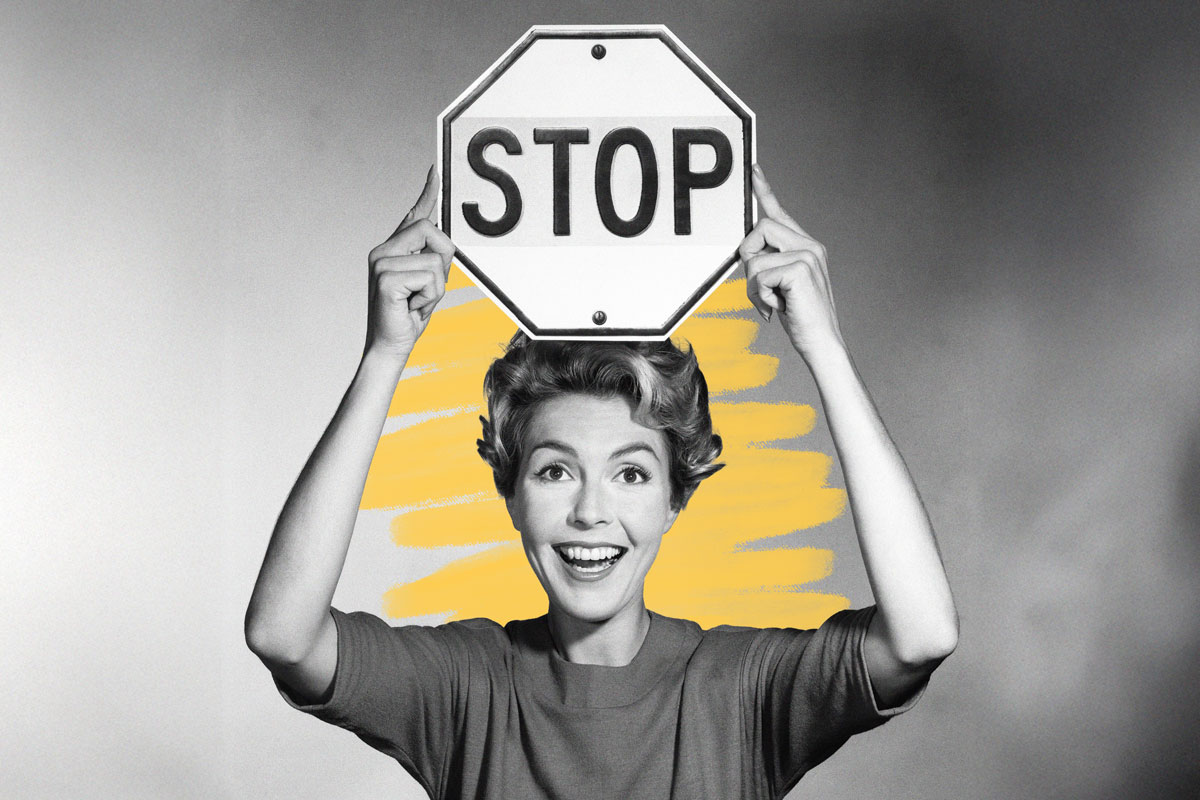
Stop signs used to be yellow, not red.
In the freewheeling early days of American motoring, traffic was chaotic and largely unregulated. The streets were a mess of horses, bicycles, and cars, and the concept of a driver’s license was still just a twinkle in a bureaucrat’s eye. To bring some sanity (and safety) to the roads, traffic reformer and New England native William Phelps Eno proposed, in a 1900 article for Rider and Driver, what’s generally credited as the first stop sign.
Mind you, these early signs, first installed in Detroit around 1915, looked nothing like the ones we’re familiar with today. They were originally a simple square sheet of metal — white with black lettering — rather than the distinctive red octagon. The eight-sided shape emerged in 1922, when a regional highway association developed a system of sign shapes based on perceived danger levels. Circles were reserved for the highest-risk situations, such as railroad crossings; octagons signaled the next tier of seriousness, making them the choice for “STOP.” The idea was that even drivers approaching the sign from behind could recognize it by silhouette alone.
Color took longer to standardize. Early traffic engineers wanted a red stop sign, since red already meant stop in the growing world of traffic lights. But durable red reflective materials didn’t exist yet. As a result, the 1935 edition of the Department of Transportation’s “Manual on Uniform Traffic Control Devices” (MUTCD) specified a yellow background with black letters.
By the early 1950s, advances in porcelain enamel coatings finally made long-lasting red signs practical. In 1954, the MUTCD officially adopted the now-familiar red octagon with white lettering — a design that soon became one of the most recognizable symbols in modern driving culture.


