


The “New York Times” logo originally had a period at the end.
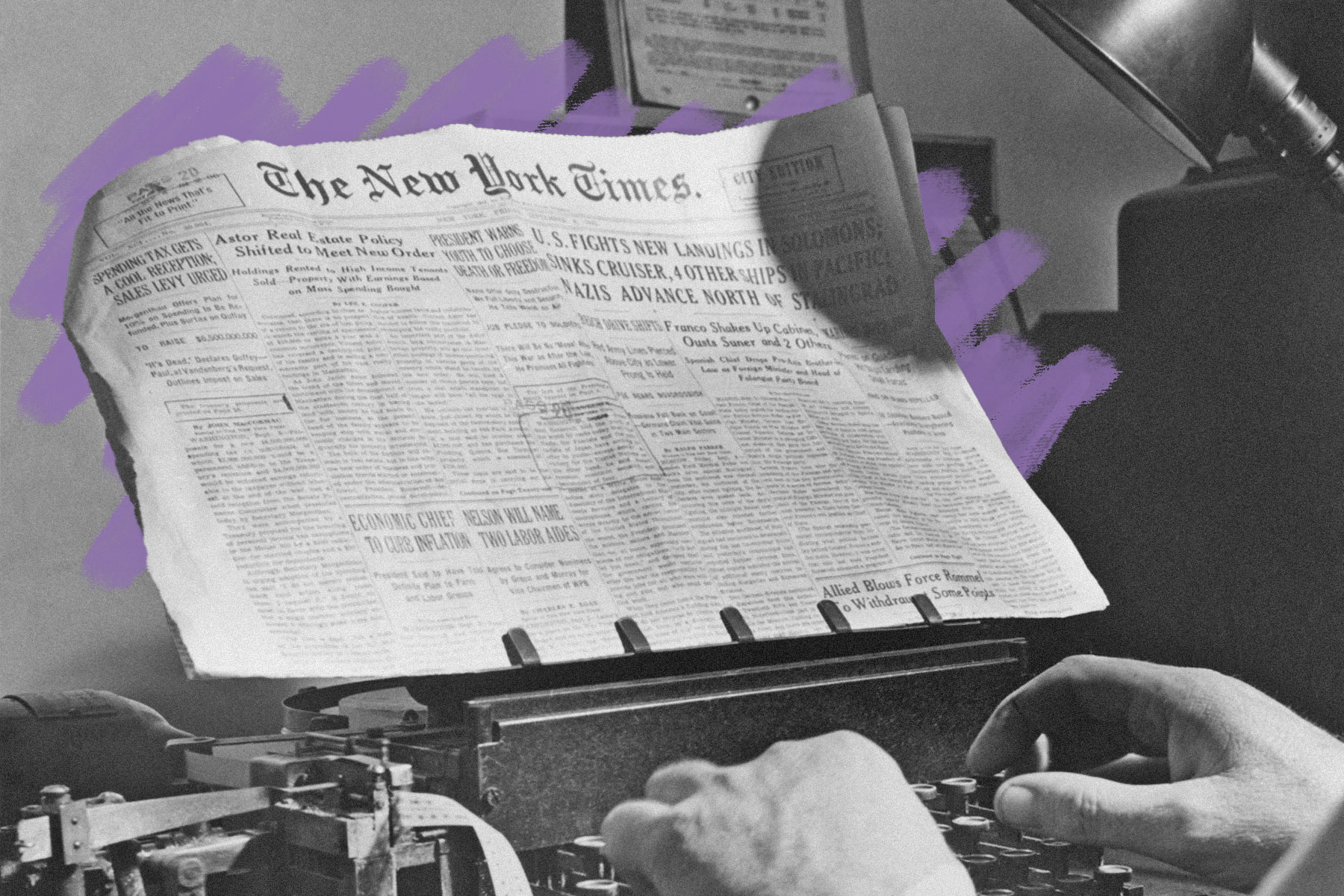
When The New York Times ran its first issue on September 18, 1851, there was a period at the end of the now-iconic logo. However, after more than a century of use, that period was removed — in part to save money on ink. The company was initially called the New-York Daily Times before undergoing its first visual revamp in 1857, when its name changed to just The New-York Times. The masthead was modified even further in 1896, when the paper removed the hyphen from its logo. But it wasn’t until 71 years later that the period was finally axed as well.
Around the middle of the 20th century, the Times sought out ways to modernize its look. In 1967, art director Louis Silverstein redesigned the logo to appear stronger and more visually appealing, by making the thicker parts of the font even thicker and the thinner parts thinner. At the same time, he did away with the period at the end, which he believed made the overall logo look less sleek and more archaic. The change had an added financial benefit, too: Silverstein estimated that dropping the period would save roughly $600 in ink costs each year (around $5,500 today). The paper’s logo has remained largely unchanged since then, outside of slight modifications to the thickness of the lettering.


